

In our newest round of Chat Wars, we decided to take a look at a slightly different alternative - Flowdock. With a stronger focus on collaboration, and not just chatting, Flowdock's combination of productivity, ease of use and solid design could prove a worthy contender for Slack.
We've been using Slack for a couple of months now, and I will admit I have grown familiar and comfortable with the design. Previously, I mentioned the lack of distinction between sections on Slack, which unfamiliar designations like the pound sign for channel names. Thanks to the customization of Slack, I've since played with my coloring and don't have any trouble finding where I want to be. However, I still feel this could be a nuisance for any new users, especially those unfamiliar with similar platforms. Slack's design is very good looking, and once you jump in it all makes sense, but it did take tweaking and use time to grow accustomed to fully. But with such a high standard set by Slack, how do you improve?
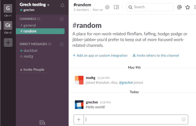
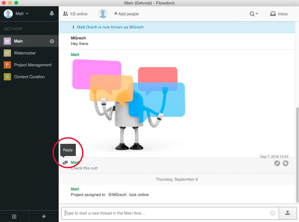
Slack seems to have covered all the basis, relatively simple with a dedicated left panel for rooms and direct messages, and a center panel for content, and a collapsible right panel for conversation details - sprinkle in some easy to recognize icons for other functions, powerful customization and you're set. The design of Flowdock is familiar to Slack, but then again there's only so many ways to design a unique chat app, and why fix what isn't broken. Although, there are a few improvements. Flowdock also has a dedicated left panel shows your rooms, or Flows, but this time you are given sections based on Teams, and Direct Messages. Each Team can have as many flows as it wants, and each flow is designated with a colored square and the first letter of that team's name. This is absolutely key for quickly identifying the exact Flow you need to be in - just look for the correct color or letter. This solves one issue Slack has - unclear designations for rooms.
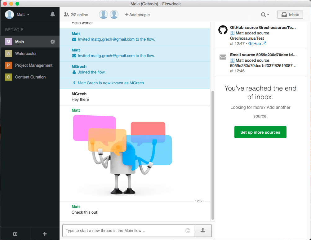
Of course your middle panel of Flowdock houses content, but this is where things start to differ. Each Flow has its own Team Activity stream to give you updates on what everyone in that Flow is doing. Clicking on a Flow will show these updates, and all existing conversations - click on one and you're brought right to it. And like Slack, there is an expandable right panel, but this time it’s for your Inbox - a constant stream of the most recent and relevant updates, whether it be messages from coworkers, their progress in projects, updates to existing conversations, or even information coming in from your integrated apps. These extra layers in design allow for more in depth organization, and even help users stay more on top of what's going on in their flows.
Winner: Flowdock - Flowdock seems to take all the things that are good about Slack's design, and continues to add more. Slack offers a quick and easy chat tool, but Flowdock's design adds in an extra level of organization, and even quick access to key updates. It also looks just as good, if not better than Slack.
Many might disagree, but I almost prefer the User Experience of Flowdock to that of Slack. Slack is proclaimed as being fun to use, and "sticky" - it makes work not feel like work with emojis and gifs. Well, Flowdock, and just about every other alternative, can do the same thing. I also feel this sentiment comes from the idea that instant messaging has been something normally left to our personal conversations, so utilizing the same method in work just doesn't feel like work. But the overall design and UI of Flowdock helps create a better User Experience by organizing things even further beyond the simple channels, or direct messages in Slack.
As mentioned previously, the Flowdock design seems to improve on Slacks and with more recognizable Flow designations, and the ability to customize the color of your Flow's blocks really stands out as a solution to a UX problem Slack had. All the goodies are still there, like the mentioned gifs, emojis, as well as drag and drop file sharing, and the amazing Inbox function. Grouping all recent and relevant updates into one specific quick access tab is great for staying right on top of it all. Flowdock even lets you tag conversations or messages with hashtags, for quick searching later, along with a list of other search options.
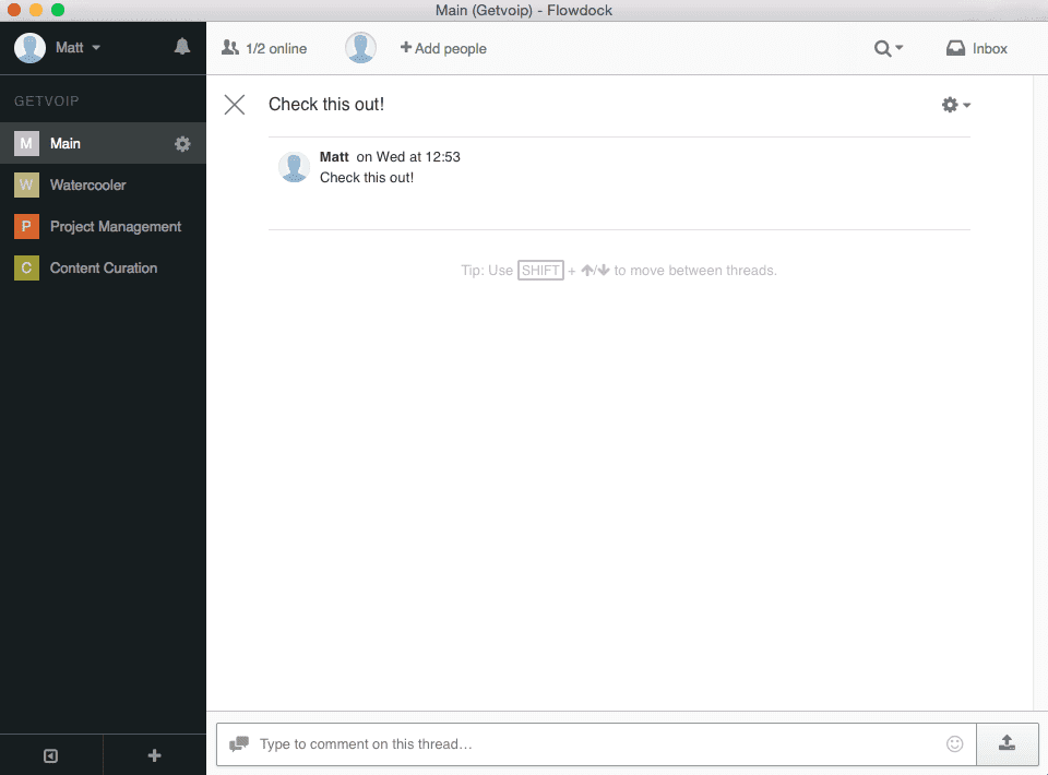
While both platforms accomplish the same thing, the advance organization of OneNote enhances the user experience because there's more to take advantage of. Sure you can keep it simple and use only one Flow for everything, with individual conversations in that flow - or you can create different Flows for different projects, or teams, or departments, so their own unique conversations are housed in that flow. Clicking the reply button on any comment brings you to that specific conversation.
This could allow for even more in depth collaboration and organization especially for those big teams. I think the Keyboard shortcuts and one click navigation Flowdock adds are absolutely huge, minimizing the time and effort it takes to do anything is what helps improve the UX, although I still wish these were customizable with your own key bindings. I also noticed the process of adding members and integrations to be a little less than desirable - forcing users to a new window for the process instead of staying within the single Flowdock screen, but this is fairly minor. Being on the receiving end of an invitation requires no action and pops you right into the Flow.
Winner: Flowdock - Slack is still a blast to use, and it’s a simple chat app that gets the job done without any hassle with some nice bells and whistles. But when it comes to collaborating and organization, Flowdock is just a leap ahead.
Flowdock isn't bursting at the seams with customization like Slack is, but it certainly isn't lacking nearly as much as other alternatives we've compared. Slack is great when it comes to customization because not only can users choose between six preset themes or two colorblind themes, but Slack even allows users to set their own themes with any color of their choosing. There's also customization when it comes to notifications, users have the option of 12 different sounds. So Slack definitely has the edge, and almost sets the standard for customization in chat apps - but Flowdock isn't too far off.
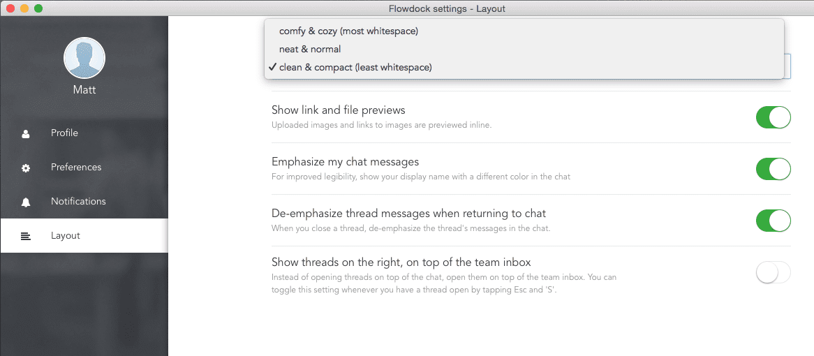
Similar to what we've seen in HipChat, Flowdock allows users to choose between a classic black and white theme or Flowdark, similar to the Night Mode of other popular apps, which transforms the entire app black with white text. Just like in Slack, there are the option of layout, but Slack has two and Flowdock introduces three with Comfy & Cozy, Neat & Normal or Clean & Compact. I elected for default Neat & Normal, but I didn't see much of a difference between the Neat & Normal setting and the Clean & and Compact - Comfy & Cozy clearly gives your messages more room.
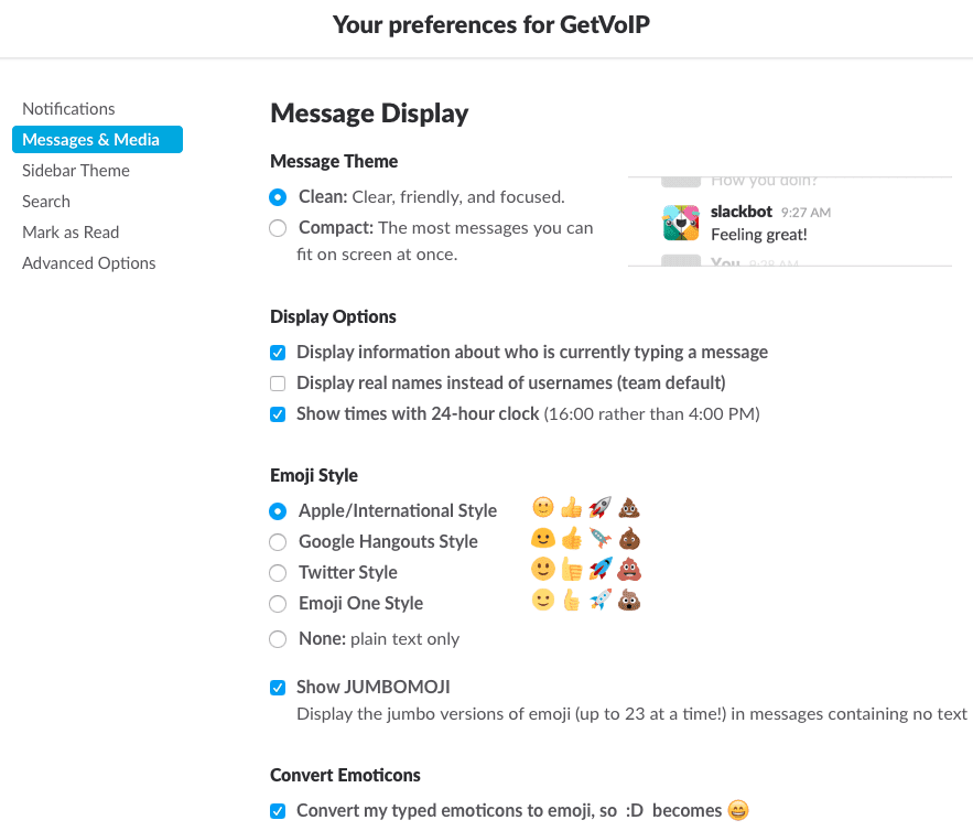
Beyond the themes, Flowdock lets you turn on or off certain functions, again like Slack, such as the display message when others are typing, utilizing Enter for sending messages, and Shift + Enter for adding in a line break, or even an Emoji Size slider to determine how big they appear in chat. Slack can't do that, although it does allow users to change between Apple, Google, Twitter or the Emoji One style - you can also turn Jumbo emojis on or off, but not adjust a slider to reach the perfect size.
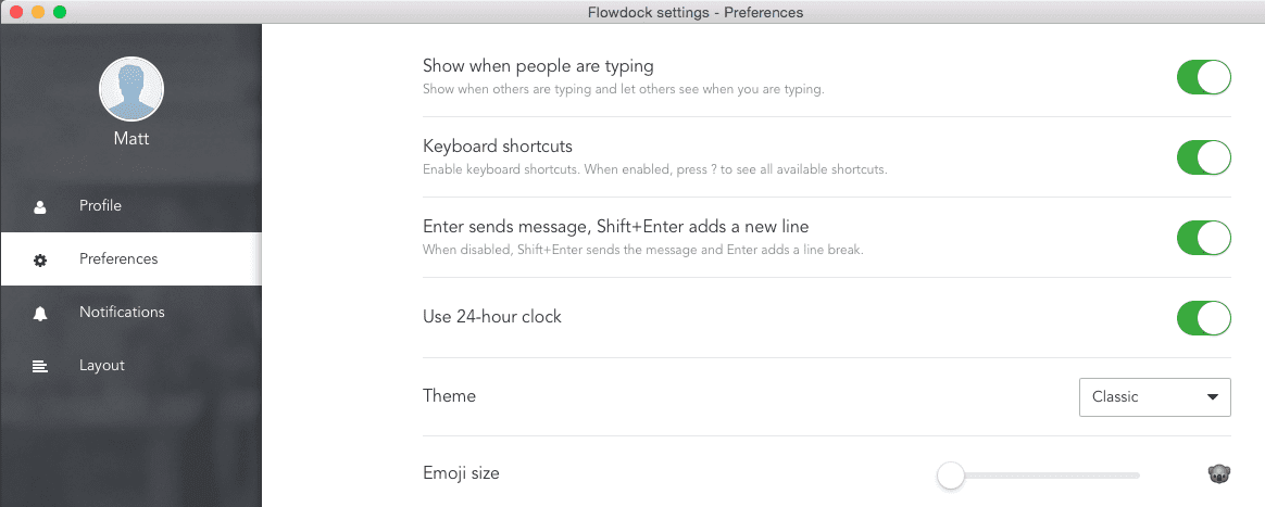
Notification options don't allow users to swap sounds, but they can mute per specific Flows, and even change the volume of each notification. Flowdock has a super useful function of keyboard shortcuts, but customization falls completely flat here - you can only turn them on or off, with no option to custom bind any keys.
Winner: Slack - While Flowdock isn't far behind at all, and is a big upgrade from other custom less apps like Cisco's Spark, it still doesn't allow for the enhanced level of customization that Slack does.
Notifications these days are fairly standard, with both Flowdock and Slack supporting mobile phone apps, desktop apps and Web based apps. Both desktop versions will take advantage of your OS's built in notification system, and ping you whenever a new message comes in. Both apps will send push notifications on your phone, and should switch when you do - so if you pull out your phone and start chatting or collaborating, the app will realize you've switch and send notifications only to your phone. From our testing, this seemed to work without much issue on both platforms, although the best results come from when you make sure to open the app on your phone to initialize the switch. And while the focus of these apps should be to remove the email clutter, both offer the option to receive email notifications for missed messages or other events.
So, both ping your phones and switch when you do, both ping you at your desktop, both allow for email notifications, and both let you mute or enter a do-not-disturb mode. How do they differ? Well it comes back to the customization we discussed before. With Slack, users can choose between 12 different sounds, specify notifications for all activity, just direct messages and highlighted words, or none at all.
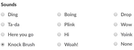
You can show or hide the message in the notifications, and for Macs even change how your Dock icon reacts. Highlighting words are great, Slack will generate a notification if a word you whitelist is said, anywhere at any time. Flowdock, on the other hand, doesn't have the sound options - but allows users to individually turn on or off sound or notifications for Chat messages, inbox messages and @ mentions.
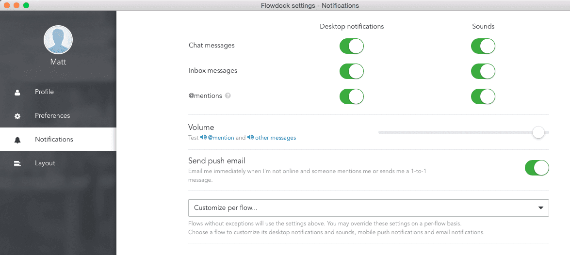
You can adjust the volume with a slider, and you can even set specific settings for specific Flows. Slack doesn't get left in the dust here either however, as users can mute individual rooms from inside that room's settings.
Winner: Slack - Between the enhanced customization, the white list for highlighted words and the ability to mute individual rooms, Slack pulls slightly ahead of Flowdock.
My biggest gripe with Slack was always a lack of native features, and the limitations placed on certain features for the cheaper plans. For example, Slack's freemium model only allows for 10 apps or service integrations, and only two-person audio calls (something that has been added since the last Chat Wars), a 5GB limit on file storage and a 10k limit on searchable message history. Of course upgrading gets you an unlimited message archive, guess access, oAuth via Google, Group Calls and expands your file store to 10GB for just the cheapest plan. But if you want group voice chats for free, or even video chat, you'll have to sacrifice some of your limited integrations.
Now I understand this is due to the nature of a Freemium model, you have to give reasons to upgrade to a paid plan - but when Flowdock uses Google Hangouts for integrated voice and video chat with no limitations, surely they could cut corners elsewhere? Flowdock also does not limit your message archive, or file storage to a dismal 10k messages and 5GB of storage. Sure that's a lot of pictures, but if you're sharing more intense documents with a decent size team, it could add up quickly. Slack has also updated their security measures for paid plans, like the previously mentioned Google Authentication, and Mandatory two-factor authentication, but that isn't something unique and would be nice to have even in a free model.
Winner: Flowdock - Features are mostly the same between both platforms, but Slack limits certain features to paid plans, while Flowdock supplies the same platform no matter how much, or little, you pay.
Both Flowdock and Slack in essence support an unlimited amount of integrations. With APIs and some developer knowledge, anyone could design and create their own integration or even chat bots to customize their platform. So the best comparison would really be what is available out of the box for either of the two applications. While Slack normally destroys the competition here with its massive App Directory, Flowdock doesn't skimp on the integrations either.
While the list might not be as extensive as Slack's directory, with over 50 integrations listed on their website Flowdock is sure to have what you're looking for. Granted Slack has probably more integrations in its Bot section of the App Directory alone, Flowdock has been the closest contender when it comes to integrations so far.
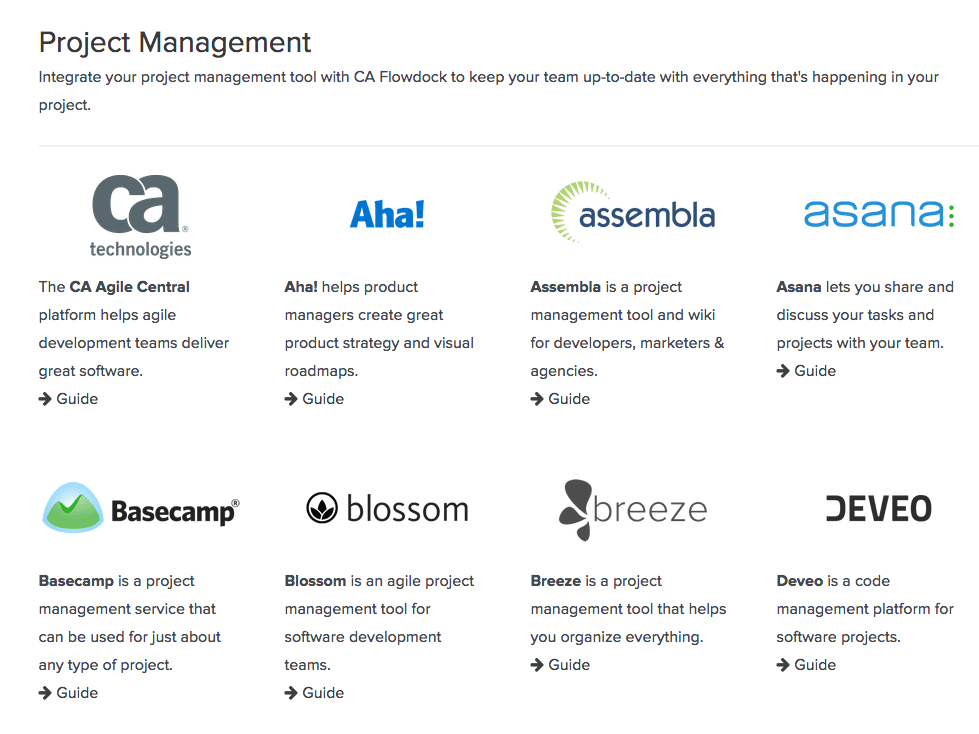
With a large list of productivity, deployment, monitoring, continuous integration, wiki, customer support, developer, and project management tools you're bound to find the other platforms your team already utilizes with in the list.
Winner: Draw - Slack might offer more out of the box, but Flowdock still provides a really solid list and supplies integrations for just about all the big name applications. There's not a big enough discrepancy to declare either platform a winner.
While of course both platforms offer freemium models for their apps, Slack has always fallen a bit behind the competitors when it comes down to pricing structure. Unfortunately, it looks to be the same fate when stacked up against Flowdock. The biggest issues with Slack’s free model isn’t a limited user base, but the limitations they do put on the app can affect its functionality. With the free model, your searchable message archive is limited to 10,000 messages – which can go by way faster than you expect – only 5GB of storage, and only 10 apps or integrations, and voice chat is only available for one on one calls. The cheapest plan at $6.67 a month per user lightens the restrictions with an unlimited message archive and 10GB of storage as well as adding enhanced security, support, and features like group calls and guest access.
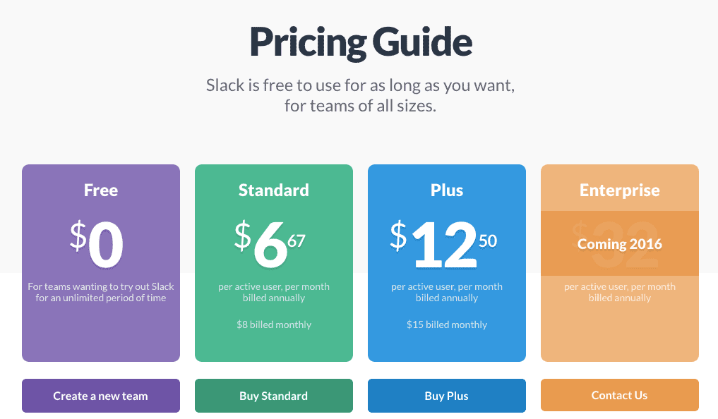
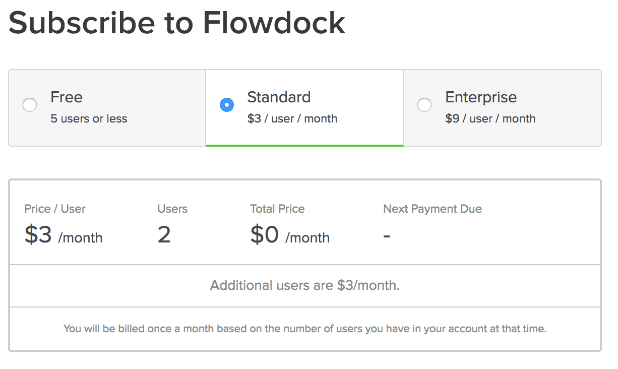
However, Flowdock doesn’t limit any of its functions or place any restrictions of features for a free model. The cheapest plan begins at $3 a month per user, and an Enterprise model is available, but pricing is on a case-by-case basis. The real kicker here is that the free version of Flowdock is simply limited to only 5 users – once you reach more than 5 you must upgrade, but only at the low cost of $3 a month. Nothing is hidden by paywalls, except team size. So while Slack limits what you can do with the app for cheaper plans, Flowdock only limits how many users you can have at one time. For small teams of 5 or less, Flowdock seems to be a bit of a no-brainer, but if you are 10 members and don’t want to shell out $30 a month, it might be worth putting up with Slack’s limitations.
Winner: Draw - Both apps have their use cases, and whether you choose to adopt the free model of either will come down to your specific use case. If you have under 6 users, you might as well enjoy the extra features and lack of restrictions Flowdock allows. But if you’re over 5, it might make sense to put up with the limitation for a free model of Slack.
Both Slack and Flowdock will meet, if not exceed, the needs of your team when it comes to simple, quick and effective team collaboration and communication solutions. Slack makes for an even simpler chat app, with less nonsense and frills - but with way more functionality than you would expect to have in a simple chat app. Flowdock feels almost like an enhanced version of Slack, and while it can be used in the same fashion as a generic, simple chat app, there's a whole extra level of depth when it comes to project management and collaboration. Flows, and conversations within flows, as well as the activity stream and inbox, take the idea of a simple chat application one step further. Searchable hashtags with no limit on a message archive, or limitations on the amount of integrations you can trick your platform out with are a usual bonus over Slack. If you absolutely must keep things free and don't mind the limited nature of Slack's free model it'll get the job done, but if your team is under 5 and wants free, or is willing to pay the low cost of Flowdock you'll still be better off that Slack's $6 per user fee.

